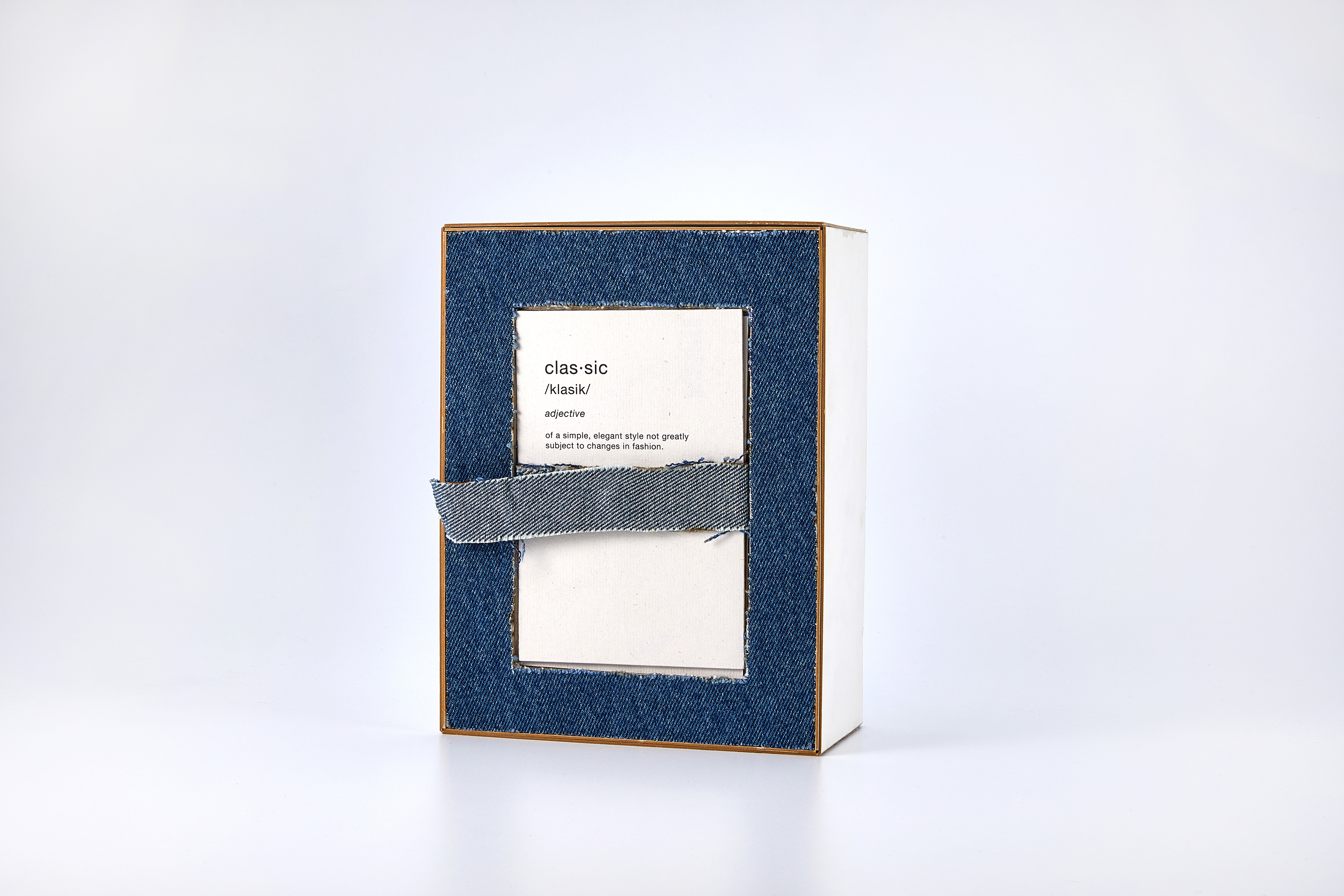
classic.
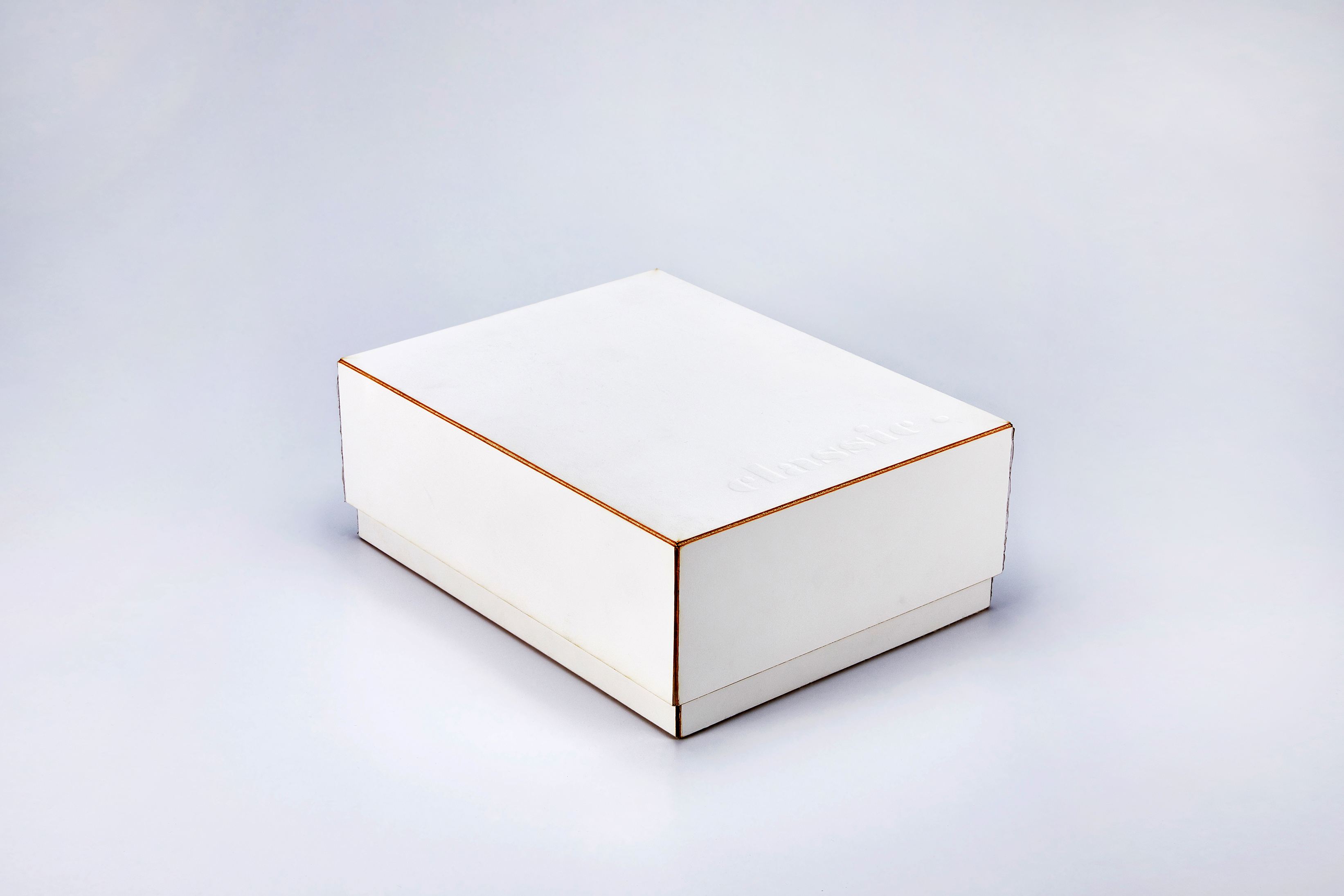
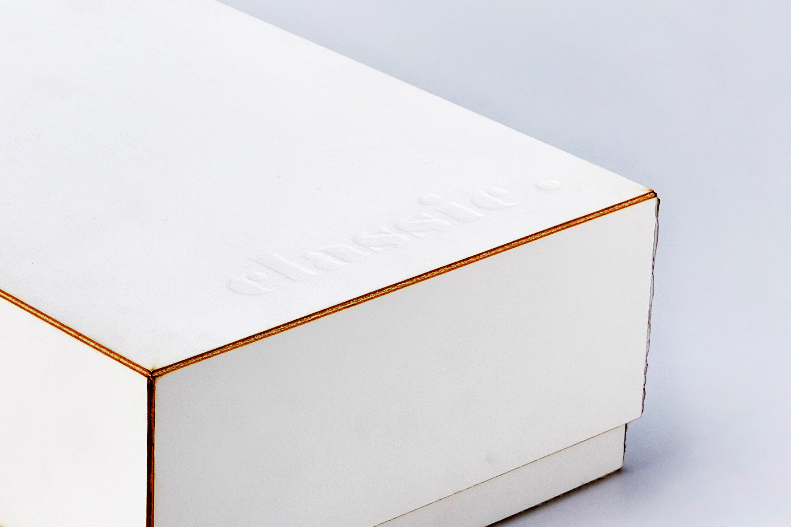
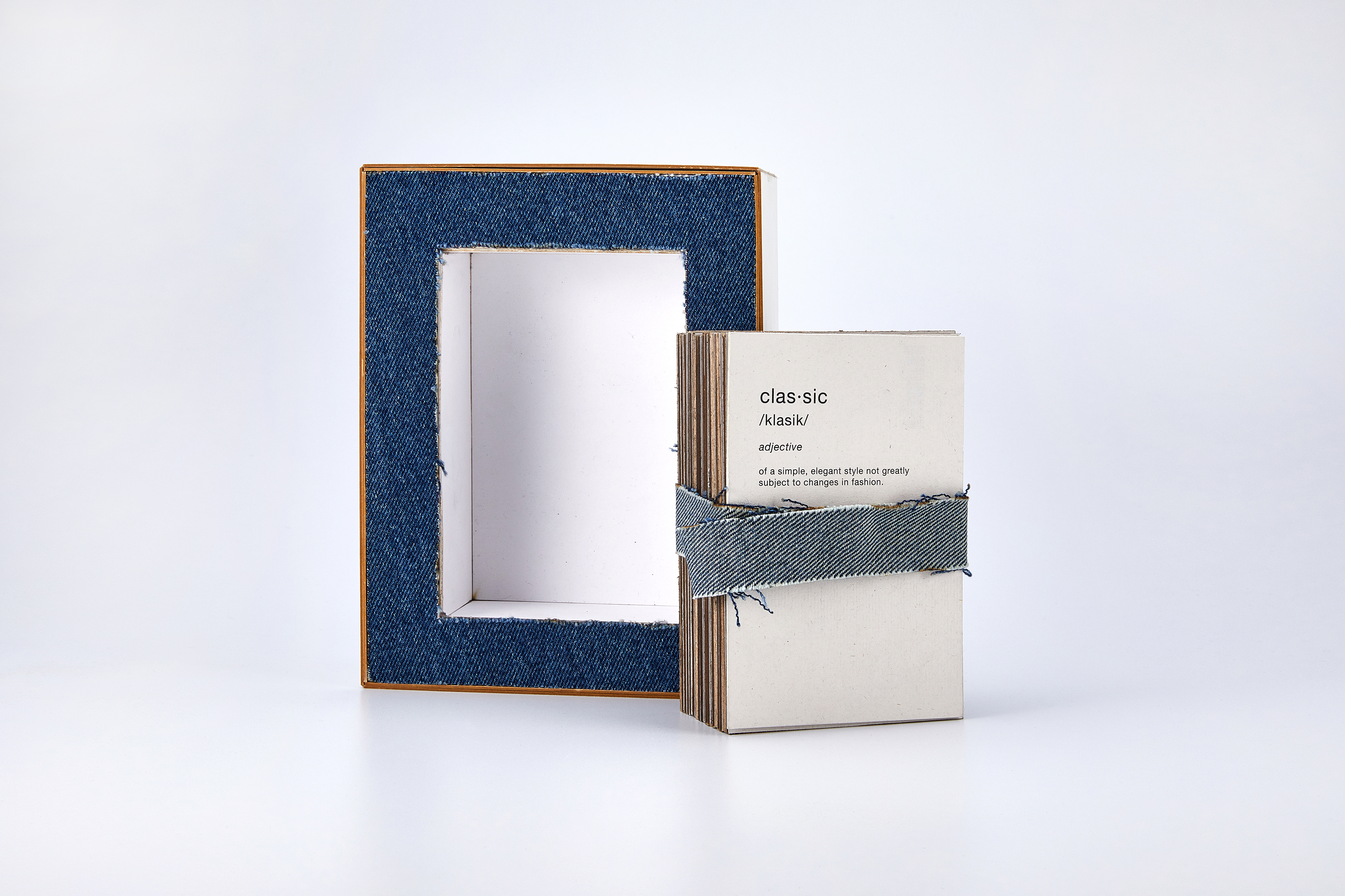
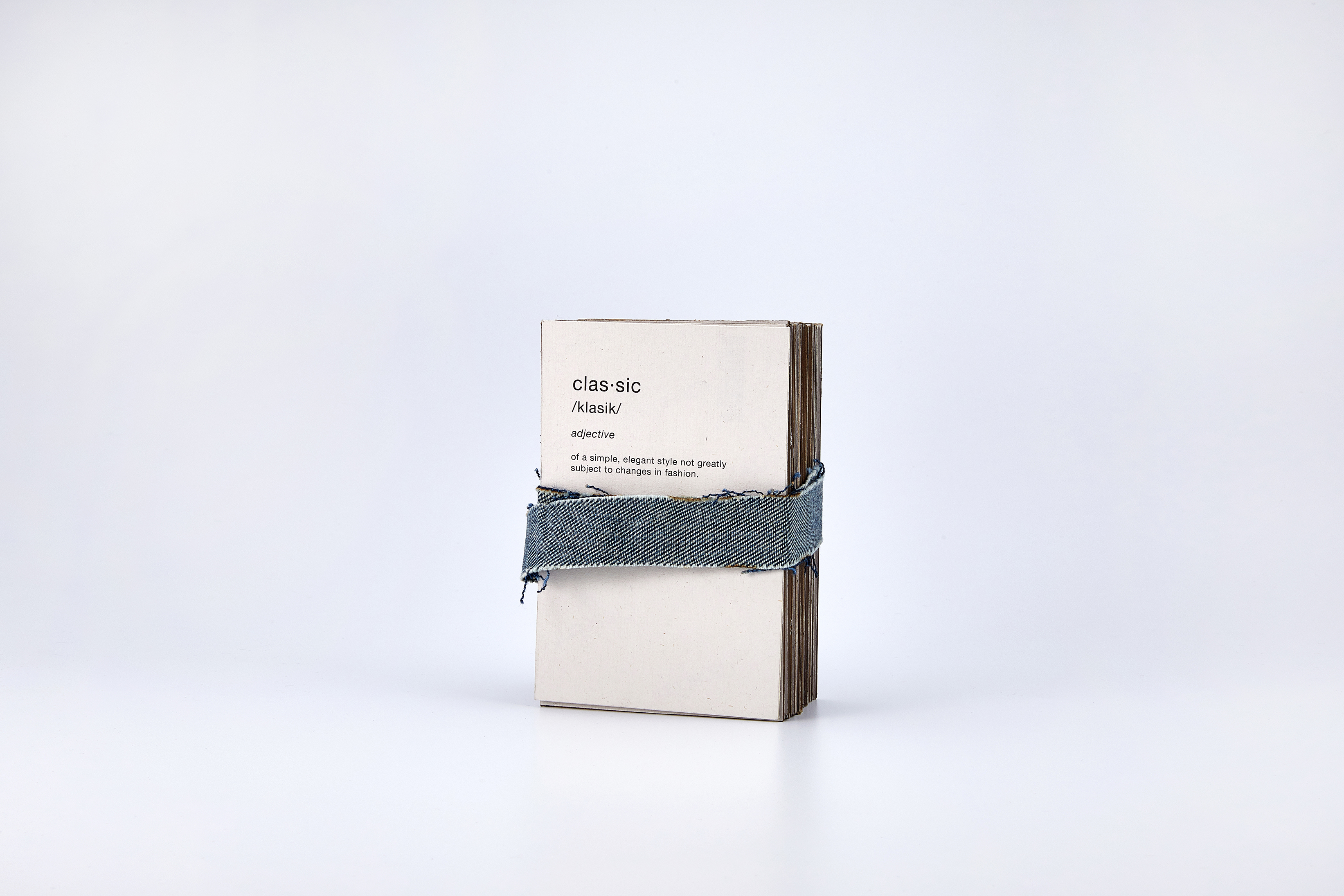
classic. is a set of cards and packaging for the cards that highlights my penchant for classic objects.
User Research | Wireframing | Prototyping
Objective
The goal of the project was to create a set of cards that epitomizes what I adore and what I am devoted to. In order to figure out the overall theme, I put together a mood board composed of 50 images of things that I am fond of, inspired by, and care of.
Research
After a thorough review of the mood board, I ended up with the conclusion that “I like stuff that are classic” — I like classic designs, typefaces, products, ads, etc. The reason behind my obsession of such an idea is that what is categorized as classic has not changed for a long while — not because people were idle but because the quality of what is classic does not change over time. Being classic means being timeless.

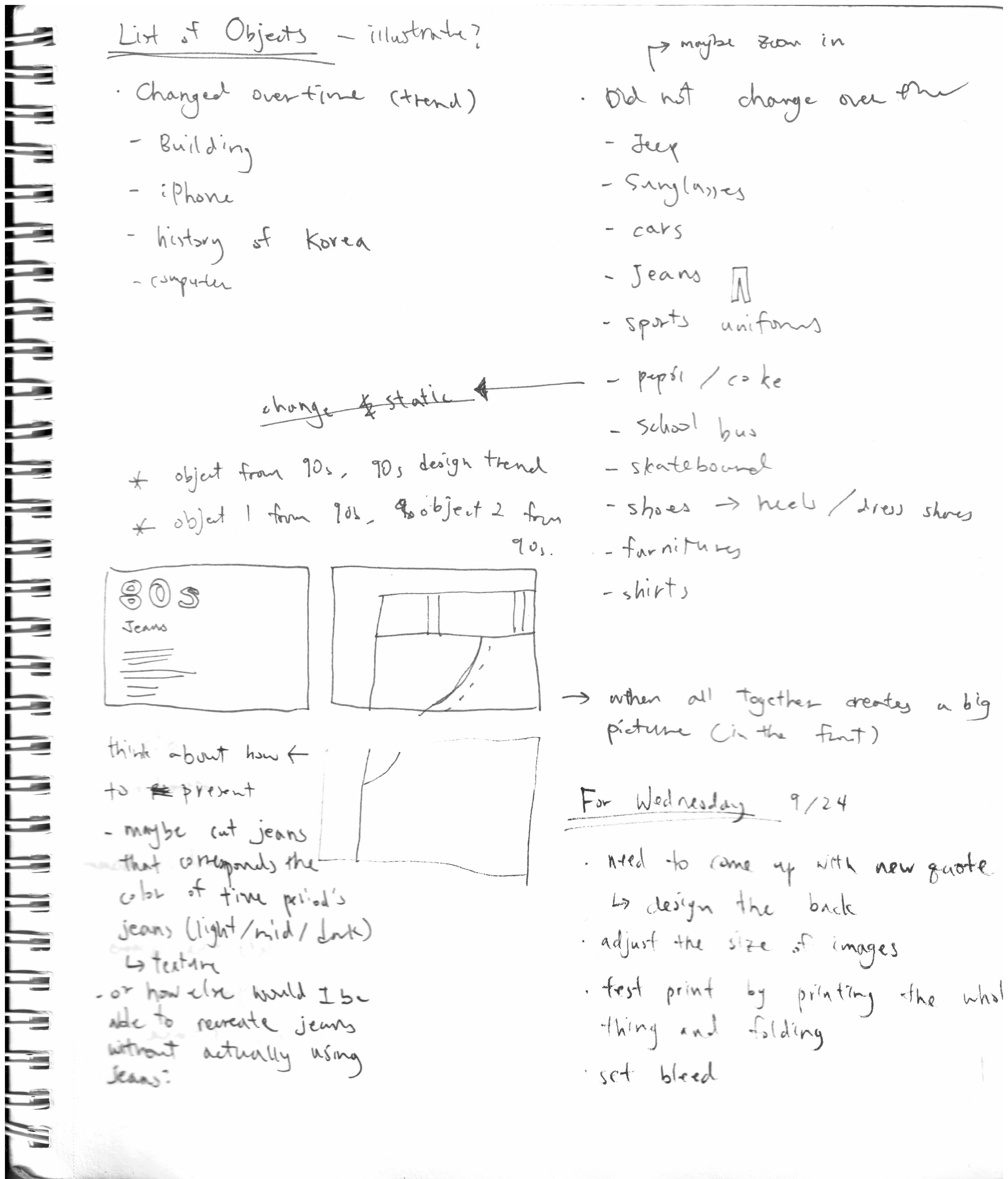
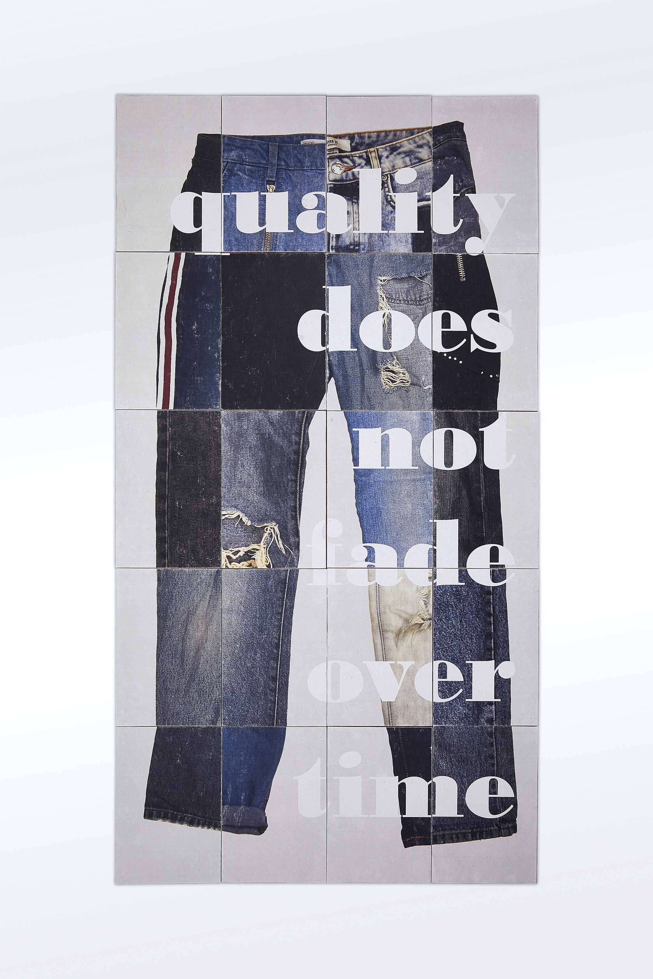
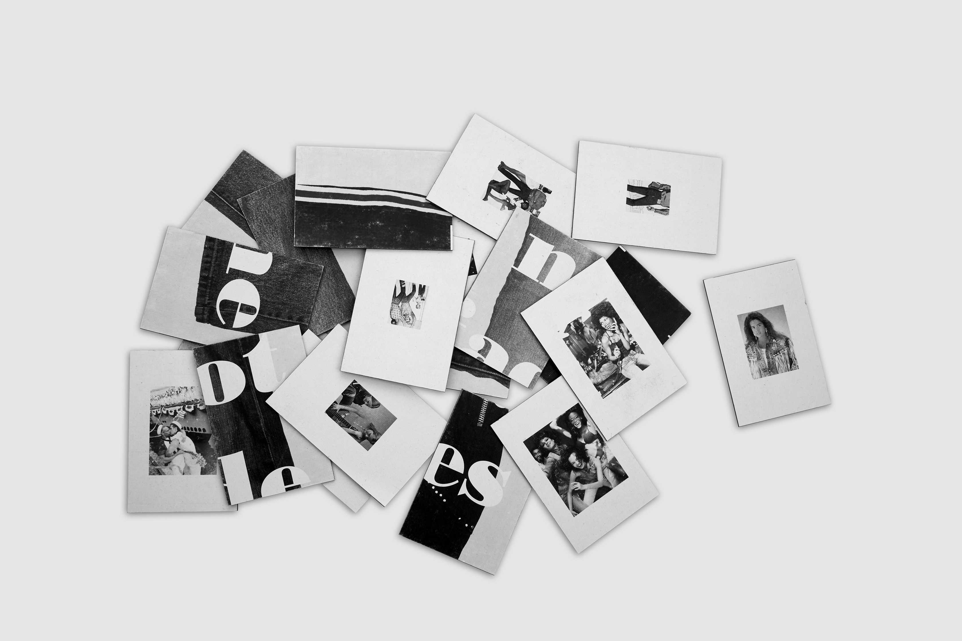
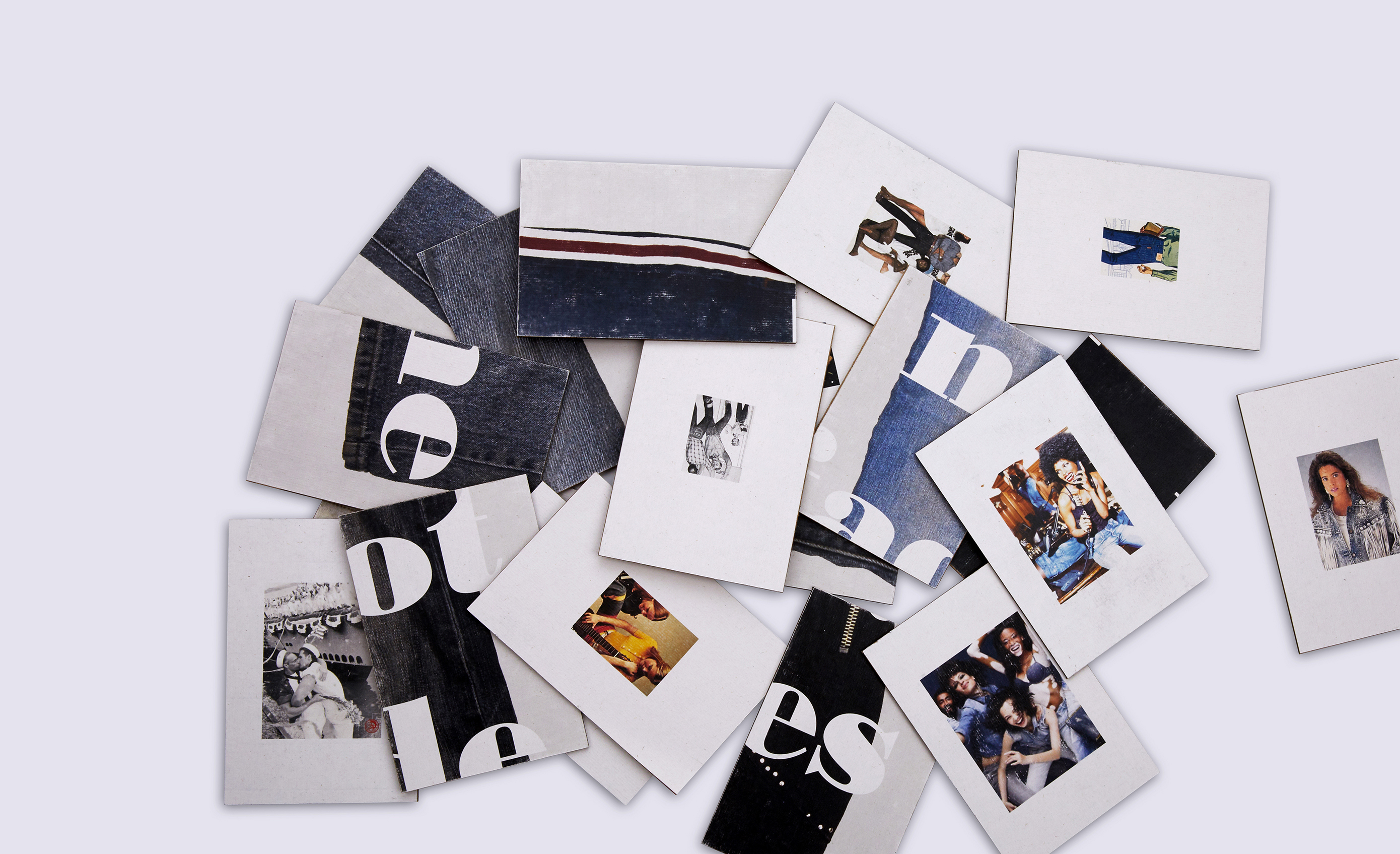
In order to portray my idea on a set of cards, I decided to use one of the most classic objects to represent what is classic: jeans. On each card, one side displays an ad of jeans, ranging from the ones from the 1940s to ones from the 2010s. The other side displays a picture of a pair of jeans from the respective time period.
If you only look at the side that displays an image of jeans, you cannot possibly tell from what decade they are from. Yet, if you look at the side that displays an ad, you can make a reasonable guess of the time period in which it was released. The first clue is color. Ads from the early 20th century have a limited color palette — sometimes even black and white. The next clue is the demographics of the models. The older the ads ads are, the less diverse the models are in terms of gender, race, and sexuality. Also, the older ads seem to have stricter beauty standards compared to the ads from the late 1990s to 2000s.
Thus, one side of the card represents the pass of time, while the other side represents the never-failing quality and timelessness of classic objects.
Final Product